Friday, May 29, 2009

More on the California Budget FAIL

Armed with a Bud Light, I found two papers which suggest that from a tax burden standpoint, California is on the high side but not insanely so. The Public Policy Institute of California notes the following per-capita combined 2005-2006 state and local tax burdens for several large states:
  • New York: $6413
  • California: $4517
  • Illinois: $4081
  • National Average: $4001
  • Florida: $3693
  • Texas: $3235
From both a tax burden and overall revenue burden standpoint, California was 10th highest in the nation. If adjusted for incomes (which are higher in California), the ranking drops to 18th. That doesn't sound that bad, although the LA times quoted a more recent study saying our overall burden was now 6th, behind New Jersey, New York, Connecticut, Maryland and Hawaii. (That LA times blog is a bit misleading as it focuses on top marginal tax rates and only mentions overall tax burden at the end of the article).

The Center for Continuing Study of the California Economy has an interesting 2007 paper about California state taxation that echoes some of the above sentiments plus provides detail about the highly progressive (and thus volatile!) nature of California taxation. It also has this cool graph showing that prior to the passage of proposition 13 California was a "high tax" state, but proposition 13 brought us in line with other states.
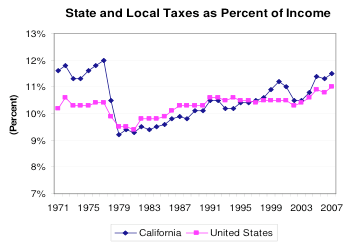
This suggests to me that our budget shortfall is the result of excess spending, not insufficient taxation. There is perhaps some room to increase the tax burden but real progress will only come from spending cuts. The progressive nature of our taxation does increase the sensitivity to economic downturn but one could argue this is an automatic stabilizer and should be retained.

It's always scary to agree with an organization with an Orwellian name like the Reason Foundation, but they come to the same conclusion:
"A good rule of thumb in government budgeting is that the rate of spending increases should not exceed the rate of population growth, plus inflation ... Over the entire 18-year period, state spending grew at an average annual rate of 5.91 percent, while population plus inflation grew only 4.38 percent a year, on average ... Gov. Schwarzenegger and state lawmakers won't fix the underlying budget problems until they admit the state has a spending addiction."
But addicted to spending on what, exactly? An investigation for another day.

A Brief Look at California's Budget FAIL

In a small effort to be a good citizen and understand wtf is going on with my state, I decided to make a picture of recent California expenditures and revenues. I took raw revenue and expenditure data and adjusted it for inflation and population. The result is per-capita expenditure (red) and revenue (green) in constant 2000 dollars.It looks like the budget was out of control in the pre-Schwarzeneggerian era (he assumed office Nov 2003), improved somewhat in 2004 and 2005, and then drunken sailor-esque spending kicked in while revenues trailed off.

A much more ambitious task would be to figure out on what the money is being spent ... hmmm ... I think I'll have a Bud Light instead.

Thursday, May 28, 2009

Profiting from Insanity

What goes up, might come down if you wait long enough.
And I actually traded this one, starting Wednesday when the tide appeared to be turning. (I'm out now).

I have my eye on the Gap which is a similar story, namely up on a earnings report which was less than stellar. However it's still defying gravity and I don't see signs of lack of support yet.
This is just a gut feeling from watching the real-time quotes stream across my desktop while I work, but I suspect some big money is accumulating this stock.

Size Matters

My startup is focused on internet advertising, and one thing we've commented on around the office is how computer monitors used to be much smaller. So what? Well, that means internet advertising used to be a much larger portion of the screen, because of IAB standard sizes were developed in the mid 1990s.

So I decided to investigate this hypothesis by cobbling together what I could find on screen resolution and banner advertising clickthrough rates. I fit the data to a 2 parameter model where one parameter was the clickthrough rate for screen resolutions higher than 1024x768 ("high resolution"), and the other parameter was the clickthrough rate for screen resolutions at or below 800x600 ("low resolution"). Note the resolution 1024x768 does not have it's own parameter, on purpose: there are only 5 data points, so I wanted to limit the model.The parameters end up being 0.2% for high resolution screens and 0.8% for low resolution screens.

Could a factor of 4 in clickthrough rate be recovered by switching to much larger ad units?

Wednesday, May 27, 2009

Natural Gas Vehicles FTW

I guessed recently that speculation in natural gas prices was unfounded since we are literally swimming in the stuff, partially due to improvements in fracing. I was right, but it doesn't count, because I didn't believe it enough to buy puts.
The more important point is that this is good for America, because oil prices have been steadily increasing even though we are still in the midst of a deep recession. Natural gas is an important part of how America avoids a future Kurt Vonnegut style dystopia. So I was pleasantly surprised to discover the Civic GX is now being produced in North America. I was doubly surprised to discover just how many natural gas filling stations there are in my area, including one just 3 miles from my house:
Considering there are only circa 150 natural gas stations nationwide, this is pretty good; hopefully with the recent budget problems these will stay open.

You can also fill up at home using a device called Phill.

Saturday, May 23, 2009

The Credit Crunch is Over, Sort of

The TED spread is a key barometer of credit market risk aversion, and it has fallen to levels last seen before the credit crunch began. In other news, treasury yields are approaching levels last seen before the credit crunch (despite or because of quantitative easing?), and the dollar has lost it's "safe haven" credit crunch aura. These developments are positive as they indicate a dissipation of the massive fear in world markets over the last 2 quarters. However, as that fear dissipates, investors will start to view the US without their rose-colored "flight to safety" goggles on. There are still plenty of reasons to be pessimistic about the US, including tremendous loss of US household wealth (including my own!), resulting consumer deleveraging, and increasing federal budget deficits. (International markets have better prospects over the short term: for example, compare the US unemployment outlook with the Brazilian unemployment outlook.)

In the face of both good and bad news, the US market is doing some very interesting things. My favorite story this week is Saks Fifth Avenue, which experienced a huge bump in stock prices after losing less money than analysts expected (seriously?), only to give most of it back by the end of the week.
Another example of temporary insanity is Deere & Co., which announced falling revenues and slashed forward guidance before the open on Wednesday, skyrocketed, and then fell back to Earth.
One analyst said it "defies logic that this company is trading higher on the news of further lowered guidance". Indeed.

Yet there is no shortage of craziness, especially in the retail sector. Barnes and Noble on Thursday had a horrible earnings report, but less horrible than what analysts expected. This is a company that even without the credit crunch is destined to be crushed under Amazon's boots, yet here is the market response:
I like to stay out of the market's way until I see signs that craziness is abating: I made modest but not maximal amounts of money on Saks and Deere this week because I waited until the euphoria had faded to buy puts. So I shall be watching Barnes and Noble for signs of buyer's fatigue.

Sunday, May 17, 2009

Gold-silver ratio developments

There has been chatter in the blogosphere about how the gold-silver ratio is historically anolomous. A picture is worth a thousand words, so here are GLD and SLV relative movements over the past 2 years:Pre credit-crunch, gold and silver were moving in tandem, but they have disconnected since then. What's going on? Everybody is asking that question, and probably those who actually know aren't talking. Although silver has industrial uses (unlike gold, which is primarily a value store), silver is mainly produced as a by-product of other mining activities like zinc, so falling economic activity leads to lower silver production: silver production dropped 5% in 2008 and another 6% decline is forecast for 2009.

A geopolitical point of interest is that China is accumulating gold; this is not a recent phenomenon (accumulation has been over the past 6 years), but people are sensitive to the dollar losing its status as a reserve currency. But apparently they've been buying all sorts of industrial metals and actually as a percentage foreign-exchange holdings their gold position has declined since 2003.

I'm noodling whether to invest in the gold-silver ratio declining; this would mean going short on gold and long on silver. However I need to get more information before committing actual money.

Friday, May 15, 2009

Would You Mail Fries with that?

The recent hike in US postage fees has led to lighthearted discussion of the suitability of Forever Stamps for speculation. The relative difficulty of liquidating vast amounts of Forever Stamps, combined with the legal requirement that the Post Office not raise rates faster than inflation, suggests no.

However it's still fun to ask whether or not this rate hike is justified; is postage historically cheap or expensive? Wikipedia claims that postage prices relative to the consumer price index have changed very little in past three decades. However the consumer price index fails to take things into account that feel like inflation (or deflation) to me personally like the purchase price of a home (it uses rents instead, because "owner-occupied housing combines both consumption and investment elements, and the CPI is designed to exclude investment items" ... gee I wonder how asset bubbles ever form).

Clearly then we must find some other barometer to judge the cost of postage, and in the spirit of the Big Mac Index I nominate the Big Mac. Note this is actually a bit stupid because the Big Mac Index is designed to assess the same item being sold in different places at the same time; over time its price relative to other stuff should move around, e.g., due to beef prices. However the temptation was just too delicious to pass up. Armed with historical data gleaned from the archives (hey, the print subscription finally had digital utility!), I assembled the price history of a Big Mac over the last decade. Without further ado, here is the number of stamps it would take to buy a Big Mac varying over the past 10 years.As you can see, postage is currently relatively cheap even after the recent price hike, since it takes circa 8 stamps to buy a Big Mac.

Tuesday, May 12, 2009

Hedge Your Home

An pair of ETPs designed to track the S&P/Case-Shiller Composite-10 Home Price Index will soon be available. In theory, these could be used to hedge against a drop in your home, speculate about a rise in home prices without actually purchasing a home, or generate extra income from your house akin to a covered call. In practice, the pair have a teeter-totter structure which is unintuitive (but necessary to track an arbitrary quantity like Case-Shiller), and the prices interact with the closing date of the underlying securities in August 2014 which make them more like a futures contract.

The ETPs fill a need because the obvious choice, real estate ETFs, are poorly correlated with Case-Shiller. However this is a definite wait-and-see, because if they really end up priced like a futures contract it might not prove useful for shorter term hedging.

Friday, May 8, 2009

America as a Price Taker

Oil is creeping back up again in price; it recently crossed $58. This rally seems anticipatory rather than demand driven; US crude oil stockpiles are at 19 year highs and China moderated their oil consumption in Q1. With only partial information, I'm waiting for USO to pull back to circa $28; then I'll buy leaps. If domestic or developing world demand is ramping due to data I as humble blogger cannot see, then I'm waiting for Godot, and I'll miss the party. C'est la vie.

Long term, of course, oil will go up. As I alluded to previously, commodities prices will not necessarily moderate in the face of American economic weakness; in other words, as developing nations increase in economic power America will increasingly be a price taker, not a price maker.

Natural gas is different in ways that are good for America but bad for speculation. Natural gas prices are radically below last years levels, and there are good reasons for this. First, the US is swimming in natural gas, thanks to a new extraction technology recently developed. Second, the infrastructure to import or export natural gas has been neglected; this adds up to the US being a price maker and not a price taker. However, natural gas has a lower carbon footprint than coal (for electricity) or oil (for transportation) and it is a proven technology for both cases (although, a large scale switch to natural gas for transportation is harder than for electricity). Clearly long term the United States is going to greatly increase its natural gas consumption. A movement into natural gas for transportation would be great for national security, the environment, and our balance of payments; but it is not imminent, and demand is forecast to fall this year. So I'm waiting to invest.

Thursday, May 7, 2009

Yield Going Up

Every American should be keeping a close eye on treasury bond yields, since the willingness of foreigners to finance our profligacy is key to our survival. Today at a record-sized auction of treasuries yields went up, meaning buyers were demanding better prices.

Generally yields are back to their November 2008 levels, and this is with the fed printing money to purchase them. Looks like the flight to safety is officially over, time to invest in dollar hedges again. I like the Australian dollar: I like to think it's because of their high yield, exposure to the commodity rebound, and integration with the Chinese economy; but in fact I'm still enamored with Crocodile Dundee.

Wednesday, May 6, 2009

More Fertility Fun

Yesterday I investigated a putative relationship between housing and fertility. I suspected that unemployment was probably a more reliable predictor. Well, unemployment data is pretty easy to come by so I poked around a bit. A one-year lag between unemployment and total fertility rate for recent data yields a visually pleasing fit.Unemployment for Q1 2009 is currently estimated at 8.1% with the March estimate at 8.5%. So this model is more pessimistic than the housing model, and predicts a 2010 total fertility rate of 2.02 (vs. 2.04 for the new housing sales based predictor); or possibly worse if unemployment continues to degrade over the year.

So the models are predicting between 0.06 and 0.08 drop in total fertility rate in a 2 year period (2008 was 2.1). This kind of movement is not unprecedented; there was a 0.05 drop from 1991-1993 and again from 2000-2002. It would be an usually large drop, but this is an usually harsh recession, so it does not seem unreasonable.

One interesting question to ponder are the possible mechanisms for lower fertility during recessions: less sex happening, higher use of birth control, or more abortions?

Tuesday, May 5, 2009

Housing and Fertility

I mused that the credit crunch was killing the housing market, which in turn might be killing fertility; after all, does losing one's home really set the mood for love? First I took a look at new home sales, courtesy of the US census bureau. I normalized the housing sales by population to get something akin to a rate.
Wow, look at that housing market crash! Next I took a look at recent total fertility rate, cobbled together from two sources. 2.1 is the magic replacement fertility level; apparently, we're experiencing a baby boomlet. However, in past recessions fertility rates dropped, so the boomlet might not last.
It's possible to regress the housing sales against the fertility rate and get a good p value if a two-year lag is used. It predicts a total fertility rate of 2.04 for 2010. Will this prediction hold up? My gut tells me the decision to have children is probably better related to unemployment numbers, and housing has been so bonkers this decade that using it to predict anything is questionable. However one of the fun things about blogging is the time capsule aspect, so I'll check back in 2011.

Another oddity I dug up while looking into this: multiple births have been steadily rising in this country for some time.

Sunday, May 3, 2009

Arbing the Global Savings Glut

I blogged recently about how foreign capital continues to invest at elevated levels in US federal debt, even as private debt instruments fall out of favor. I mused that one thing Obama could do to arb this would be to issue credit cards to Americans.

So I was very interested when I heard about Build America Bonds. These are municipal bonds, but unlike typical municipal bonds they are not US federal tax-free. Instead, the federal government subsidizes 35% of the interest rate payments, i.e., the issuer of the bond offers a higher yield to compensate for paying taxes. This might seem like a tortured dance until you realize foreign investors are not subject to US federal tax on their bond income. Therefore, up to now, they have avoided tax-free municipal bonds with higher "effective pre-tax yields". Clearly Build America Bonds were designed to attract their attention, and sure enough a recent auction by California was gangbusters. (Ok, a less cynical possible design rationale is that domestic investors from the lower marginal tax rate brackets will find these bonds more attractive than tax-free bonds; somehow I don't think that was the aha moment behind these.)

Given that the domestic personal savings rate is trending higher, and marginal tax rates are almost certainly going up in the next few years, classical tax-free municipal bonds will have more domestic money chasing them with a higher effective pre-tax yield. In addition, the Build America Bonds provide an alternative market competing for yield which attracts foreign interest. It's a good time to be a local issuer of debt: Obama has handed you a federally subsidized credit card!

Friday, May 1, 2009

Diseases, Labor Supply, and Income Equality

All the recent discussion of a global pandemic got me thinking about the Black Plague. The Black Plague was actually really good for labor; it is commonly believed that by killing 2/3 of the population in Europe, the Black Plague radically altered the supply of labor and forced feudal lords to end peasantry.

What about the converse? Lately, there has no real threat from disease or war and the population has been growing nicely. That made me wonder if perhaps the supply of labor has been increasing and therefore the balance of power has been shifting to capital.

Certainly the US has developed an increasingly inequal income distribution over the past 30 years. The US census bureau has historical data on the Gini coefficient you can download and play with, which will yield a graph like this.Lower numbers are "more equal", so we've been getting worse. Reaganomics at work! Since it has been growing over the past 30 years we could regress against anything that has been growing during this time and get what looks like a meaningful correlation, including regressing against either population or working age population. So that seems like cheating. Therefore I tried not to cheat by looking at the current distribution of the Gini coefficient across the world courtesy of the CIA world factbook. However I couldn't find anything by regressing this against measures of "labor supply". For instance, here's a scatter plot of Gini coefficient vs. working population fraction.
So back to the US historical data. I decided to feel ok about regressing it against the balance of payments normalized by GDP. This is only partially a measure of labor supply in that importing alot means people from other countries are doing work for you.Don't take this as proof of causality; it's too easy to find all sorts of stuff that essentially monotonically increase over the past 30 years. However, if you already think that globalization has shifted the balance of power from labor to capital by radically increasing the labor supply (which I do), then you can take this as an estimate of the size of the effect. That's not a meaningless result, because we can say that eventually the US will have to have a net zero balance of payments; the globe will not labor for us indefinitely. Thus, once we are in balance, we can predict what the Gini coefficient of the US will be: about 0.41. This is substantially lower than the current Gini coefficient (circa 0.47), comparable to Russia's current Gini coefficient and the US coefficient in 1982.

Ross Perot's giant sucking sound notwithstanding, to get back to the Great Society 1968 levels of equality (Gini coefficient 0.38) we'll need to change more than our trade policies; we'll have to change the tax code and social net as well.